Tamedia Network News Website Relaunch
Tamedia Network News Website Relaunch
2024 | 👉 Editorial design
Client:
Tamedia/TX Group, Zürich, Switzerland
Brief:
Redesign of news websites for Tamedia titles with an emphasis on content bundling, live reporting, and visual hierarchy.
Case:
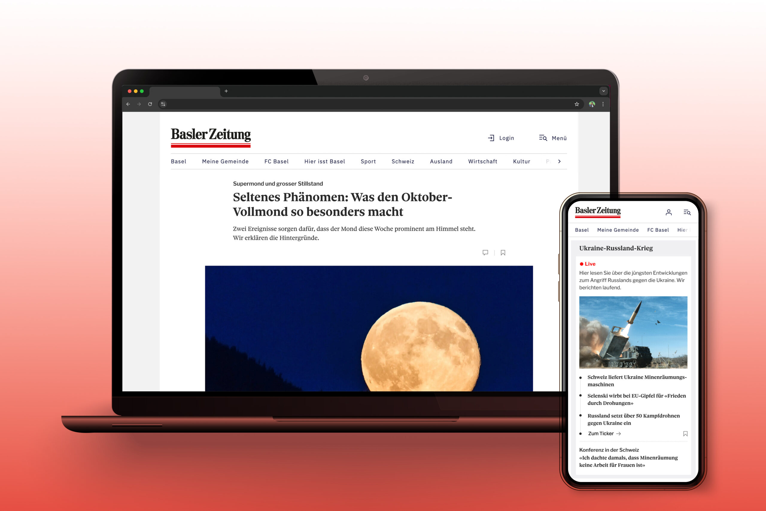
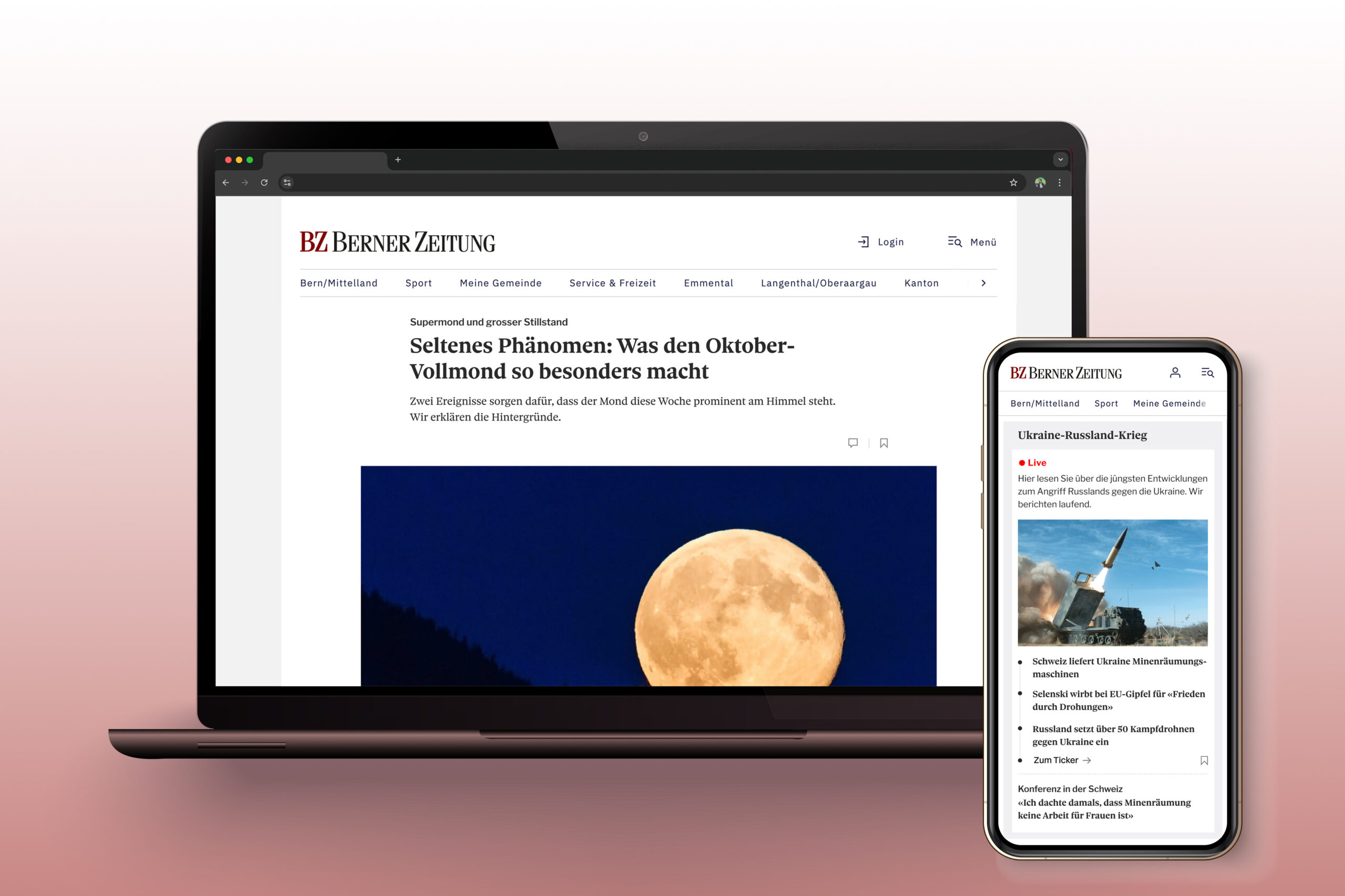
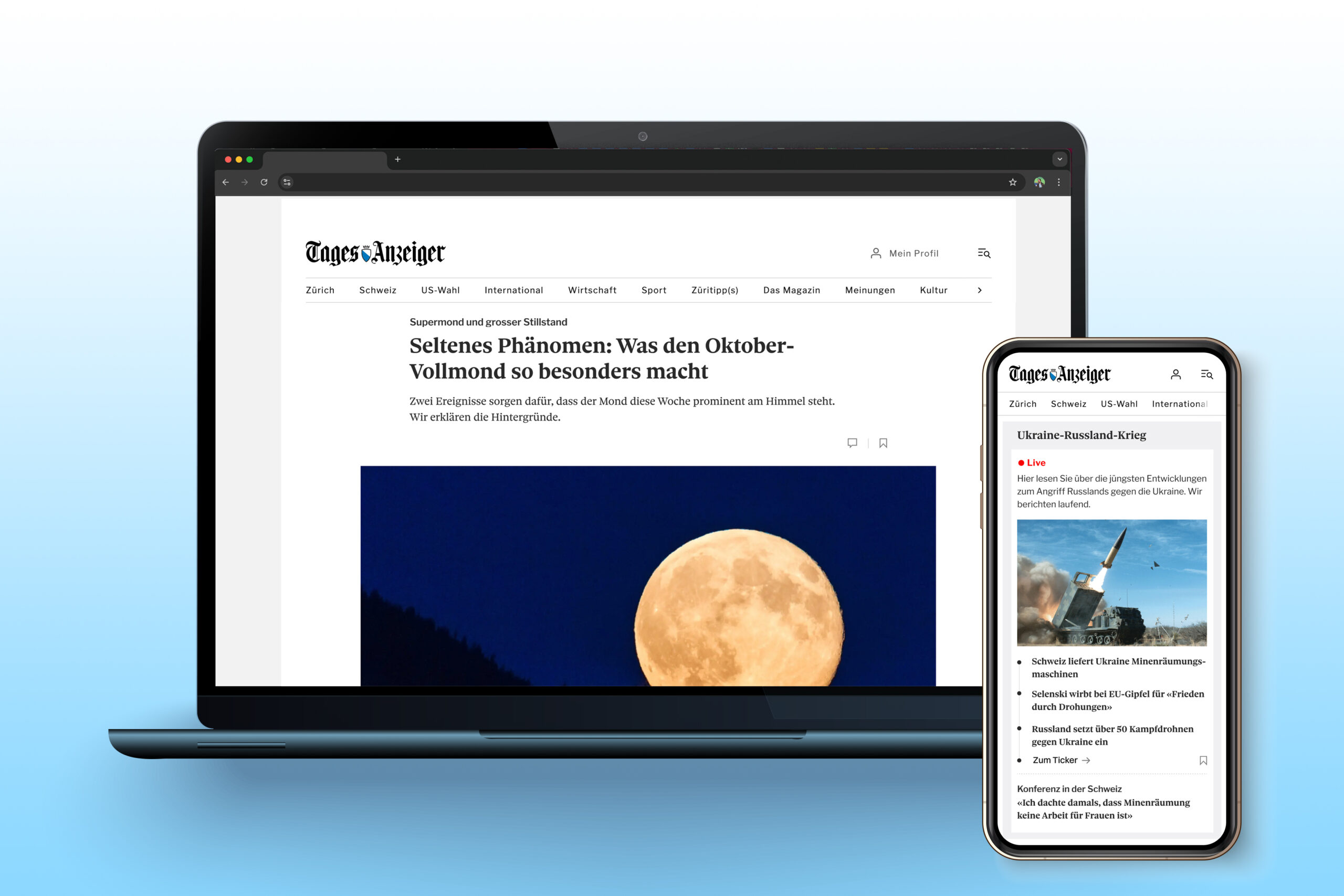
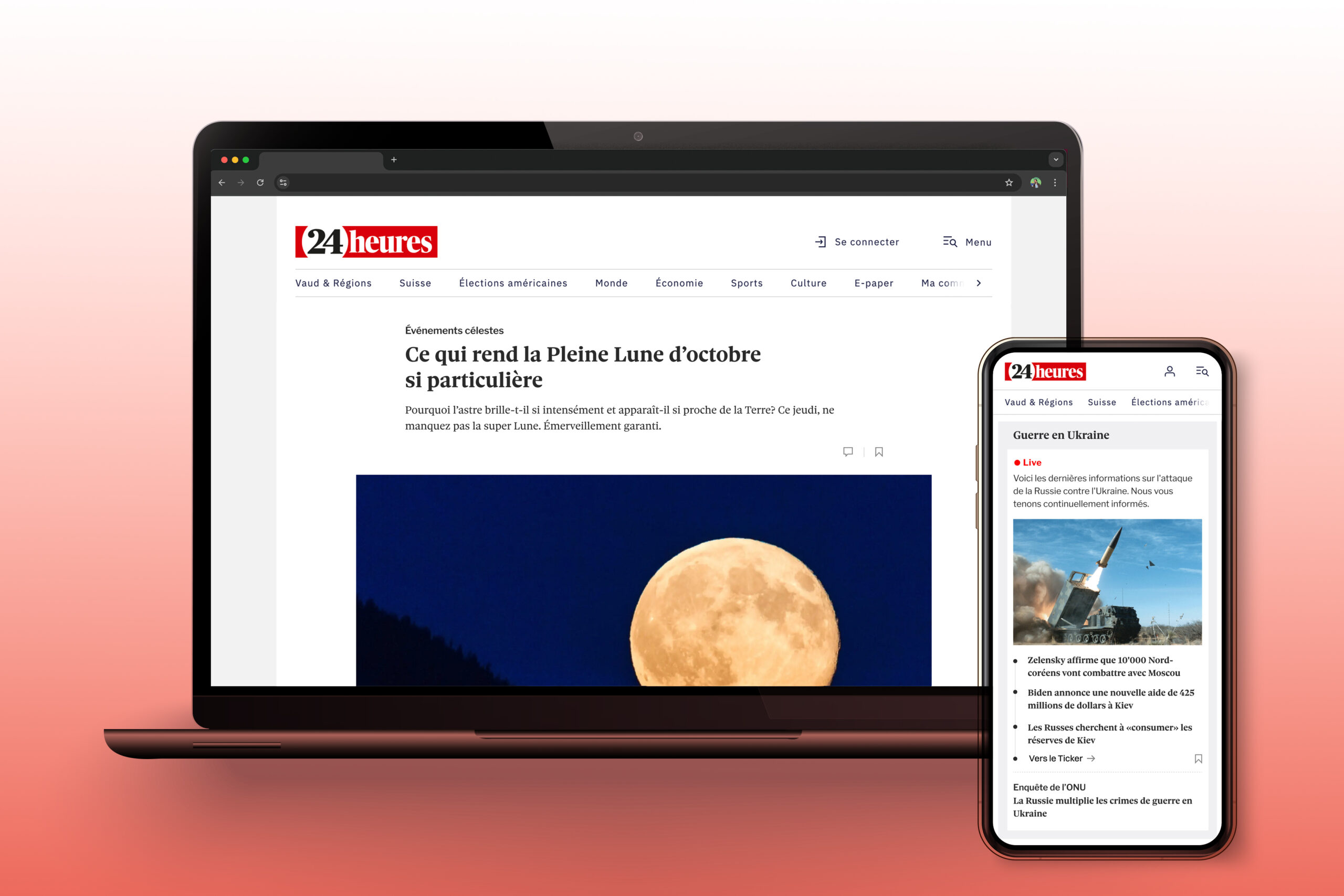
For Switzerland’s largest media publisher, Tamedia, this project redefined the online experience across their flagship publications, including Tagesanzeiger, Baseler Zeitung, Berner Zeitung, and 24heures. The redesign emphasizes content bundling, making related stories and live reports easily accessible while ensuring a structured visual hierarchy on smaller screens. Each platform was redesigned to maintain consistent typography and a unified user experience across channels, enabling readers to engage more fluidly with breaking news and in-depth articles, regardless of the device they use.
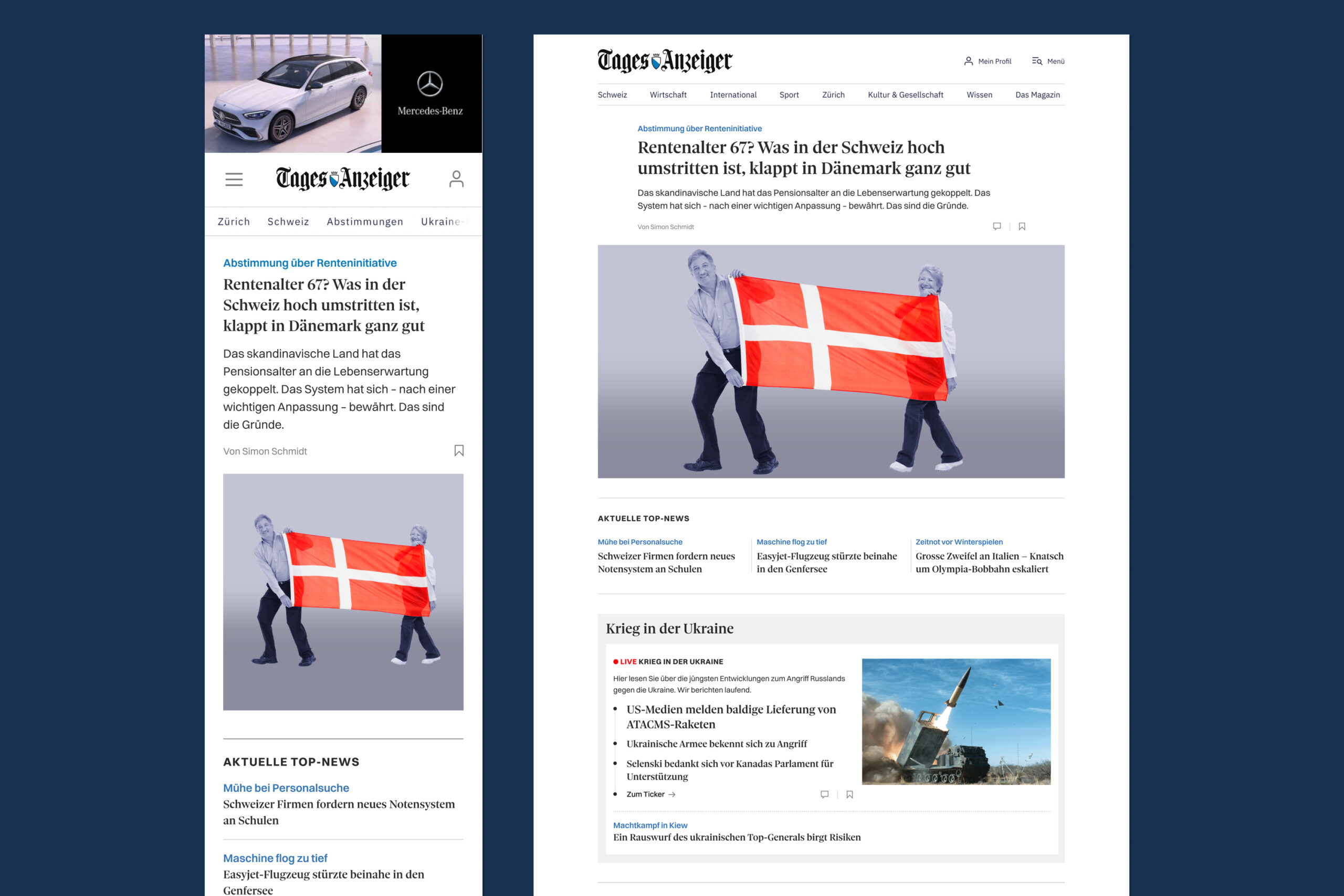
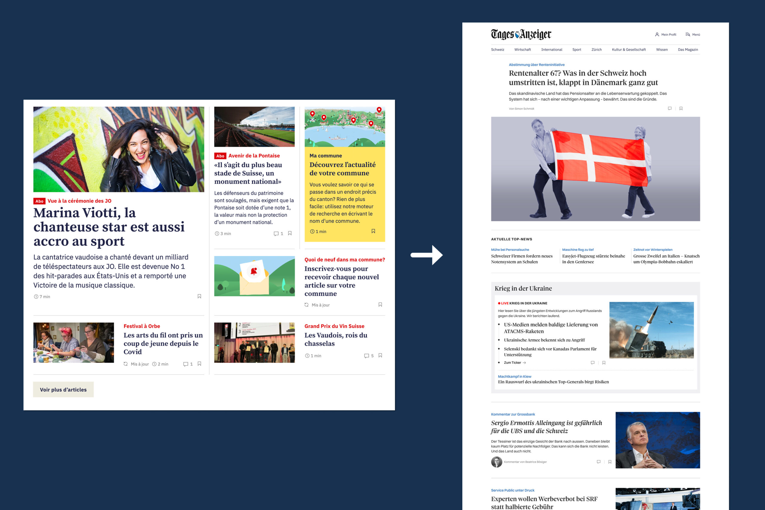
The previous website was developed with a strong "desktop-first" approach, which led to complexity in managing the site and many teaser spots on mobile that appeared without images in the first viewports. The new layout was designed with a "mobile-first" strategy, focusing on a simpler, more streamlined list view.
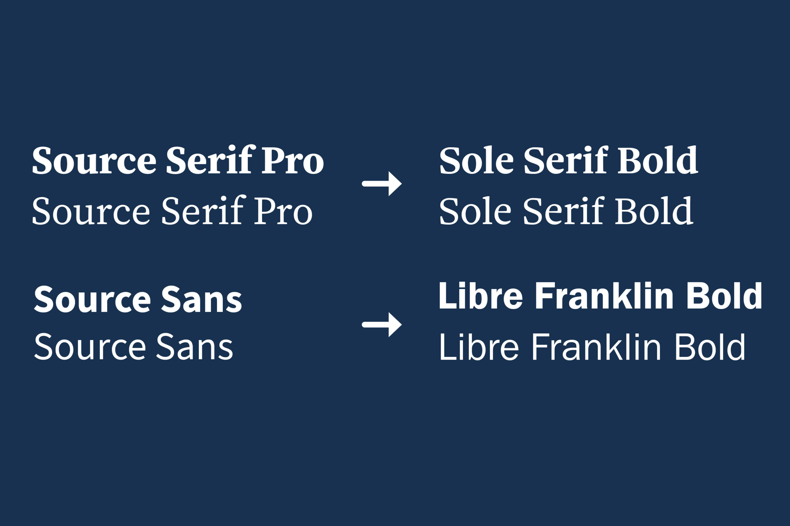
The foundation of the relaunch was the professionalization of the typography. The previously used Google Fonts were replaced by Sole, which is also used in print as both the headline and body font.
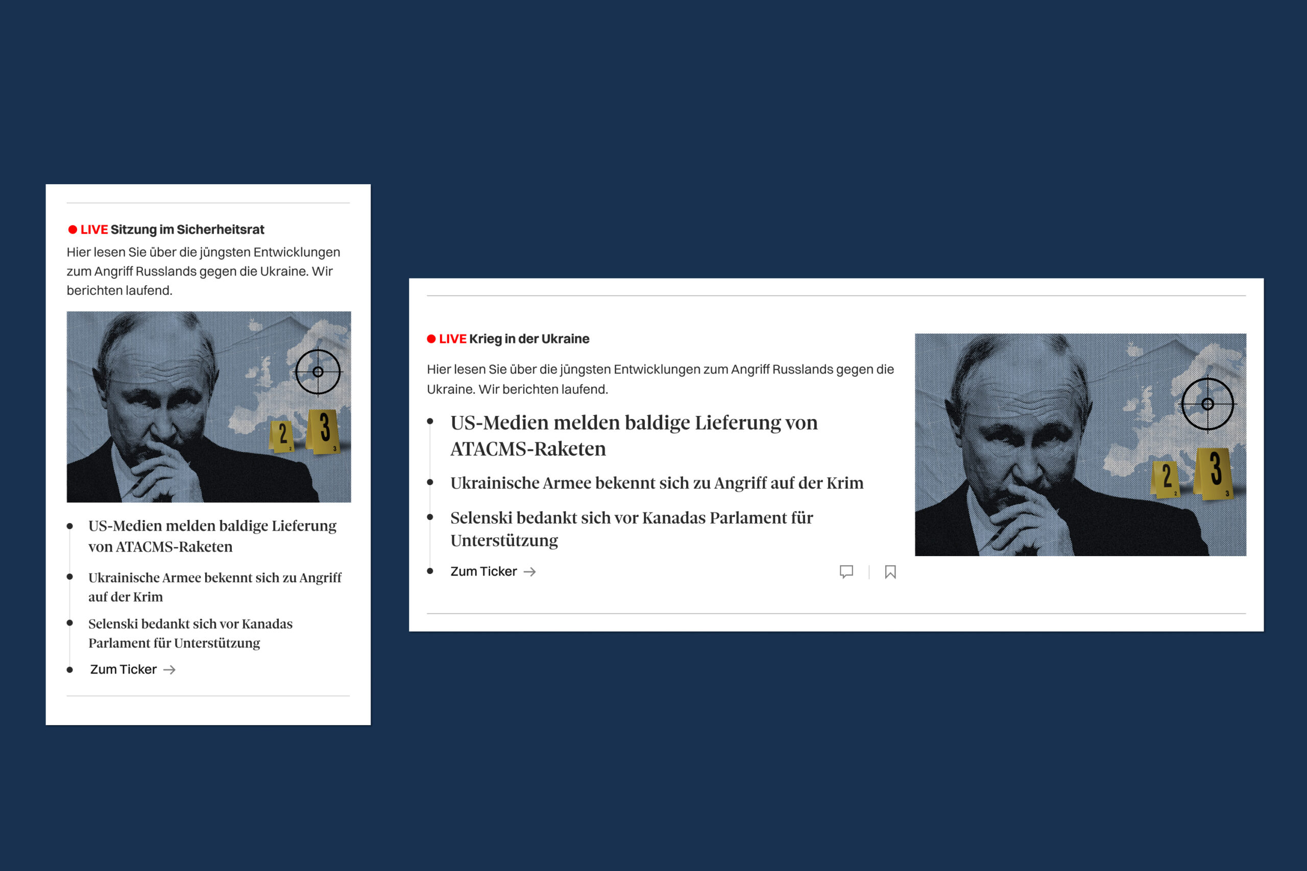
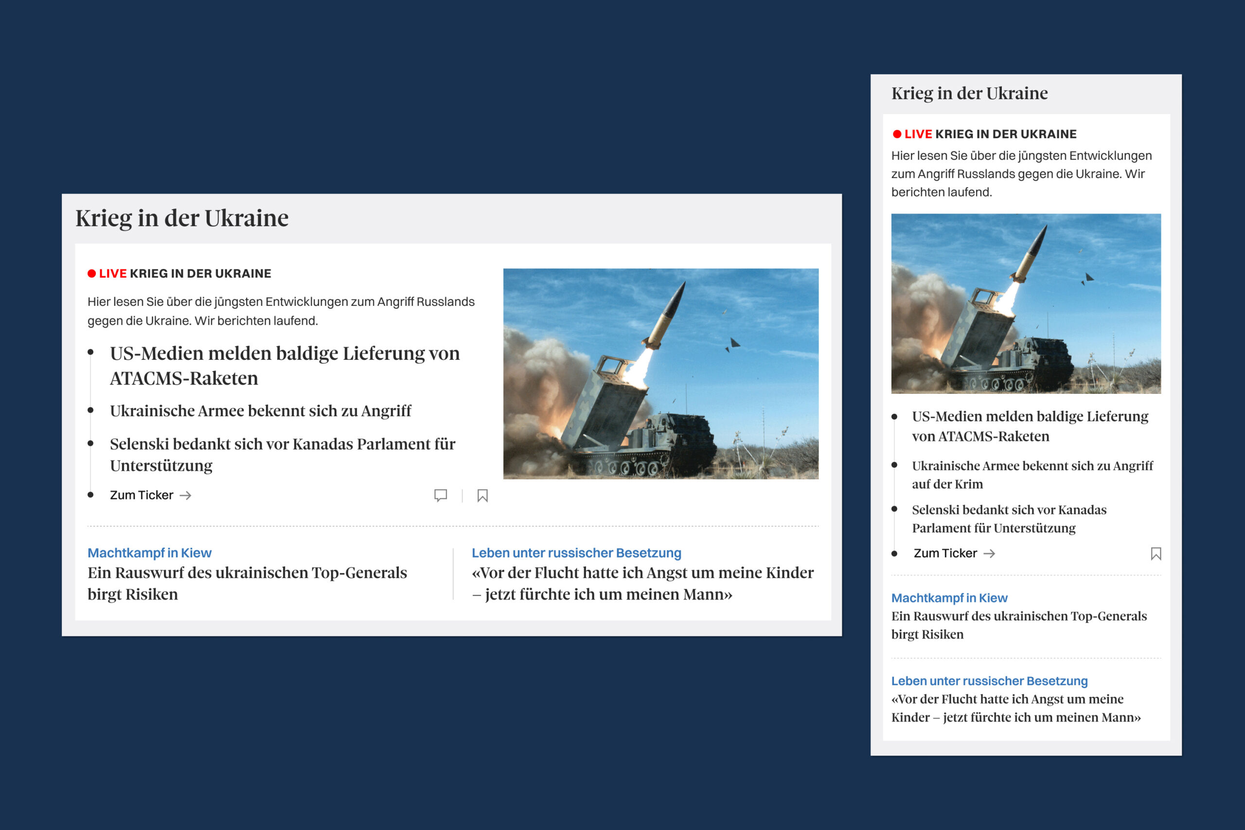
The presentation of tickers and live reporting is a key focus of the relaunch. Users can now see the headlines of the latest posts from the live blog directly on the teaser level, making current news developments and their pace more visible.
Content bundling is another key focus: Previously, there were limited options for editorially bundling content to provide more context on specific news topics. Additionally, setting focal points on the page was very inflexible. New "bundle teasers" now make this possible.
In addition to magazines, Tamedia operates 15 news brands across Switzerland. The relaunch was applied to all brands in the German-speaking part of Switzerland and the French-speaking Romandy region.
