Tagesspiegel
Rebranding a 75-year-old media brand
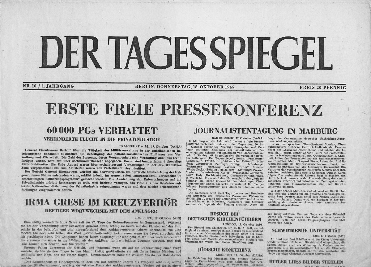
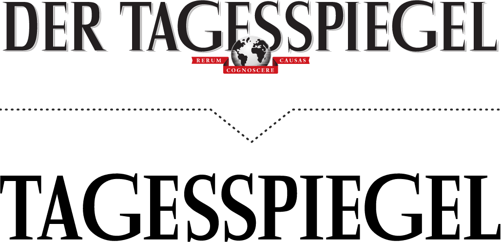
The logo of Der Tagesspiegel has a rich history. Der Tagesspiegel, first published on September 27, 1945, in Berlin, used a logo until XXXX that subtly separated the words 'Tages' and 'Spiegel': an overt visual representation of the two adjacent glyphs 'SS' was to be avoided.
The SS, during the Nazi era, stood for the 'Schutzstaffeln,' which served Adolf Hitler as a tool of rule and oppression. Particularly due to its prominent logo with the two adjacent glyphs SS, omnipresent in Nazi Germany, it was crucial that it did not appear in the masthead of Der Tagesspiegel:
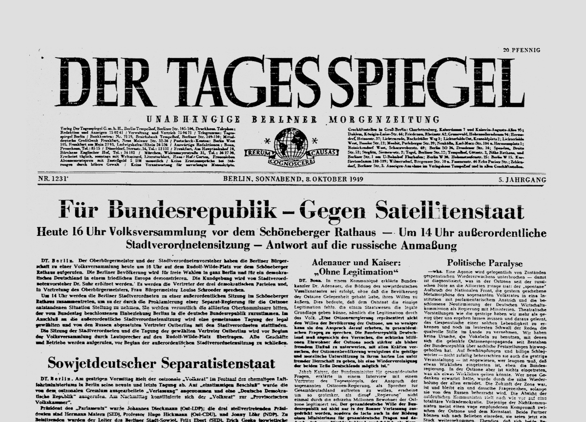
The glyphs of the logo, featuring a distinctively wider “G” and unusual serifs, were designed by an unfortunately unknown designer. In 1949, the motto of Der Tagesspiegel, which still persists today, was first placed in the header of the newspaper – “rerum cognoscere causas,” translated as “to recognize the causes of things.”
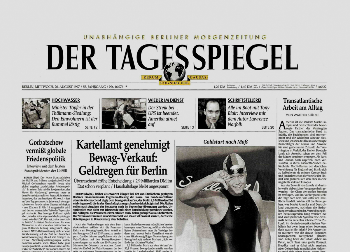
In the 1990s, Der Tagesspiegel was printed in color for the first time – and the logo underwent a significant overhaul: “rerum cognoscere causas” and a graphical representation of a globe became part of the logo.
With the advent of the web in 1996, the requirements for the Tagesspiegel's logo changed, but a revision of the logo did not take place over long periods. It wasn't until the increased mobile usage of the site and a smaller representation of the brand that it became clear the logo needed to be adjusted to fit the new usage and display conditions.
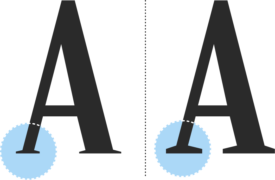
Together with the Estonian font designer Anton Koovit, we developed a font derived from the logo in two styles: one featuring the very sharp, distinctive serifs of the original logo, and another with slightly reinforced and more robust serifs for use in the digital realm.
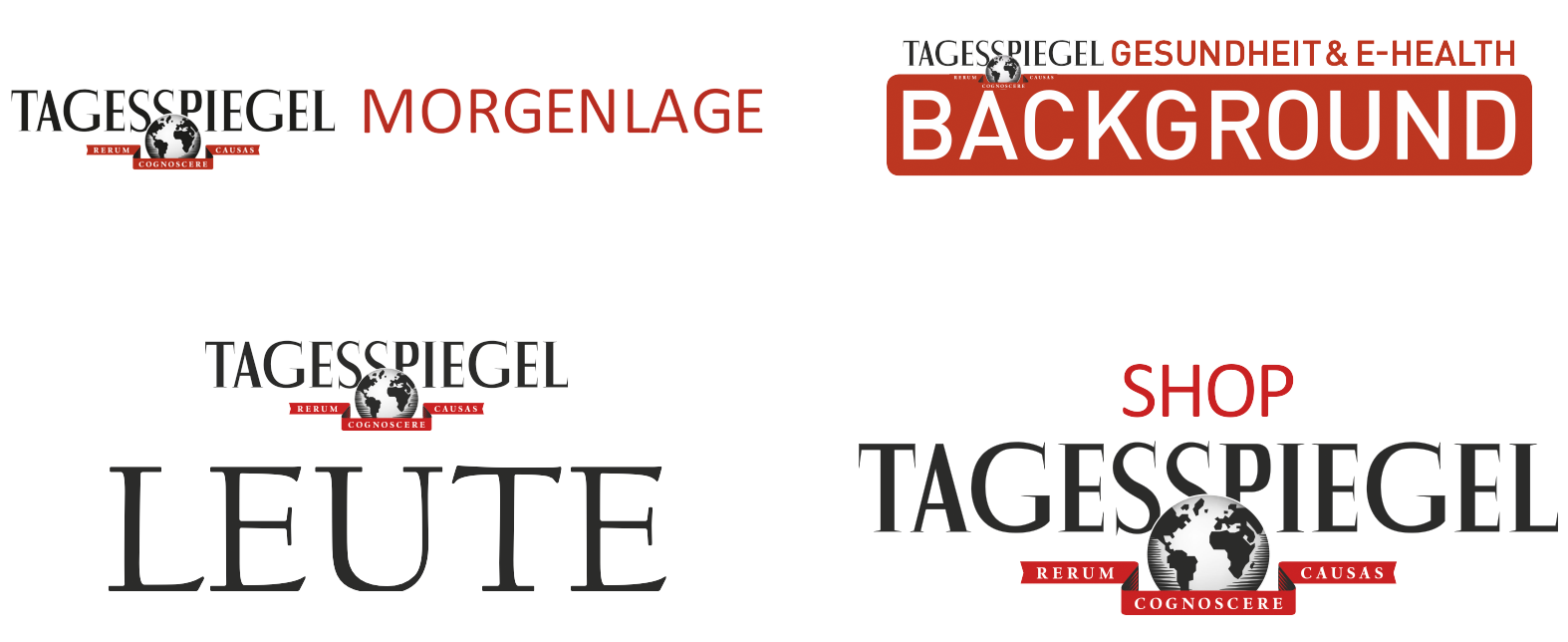
For sub-brands of Tagesspiegel, there was no systematic approach, resulting in quite a proliferation of information architecture and typographic approaches. Derived from the logo, a style guide for handling sub-brands was developed. The Tagesspiegel sub-brands before 2020:
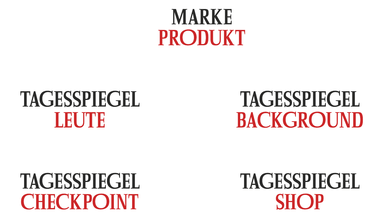
The Tagesspiegel sub-brands after 2022: A clear visual architecture with the parent brand Tagesspiegel in the first line, and the sub-brand, such as the newsletter product Checkpoint, in the second line:
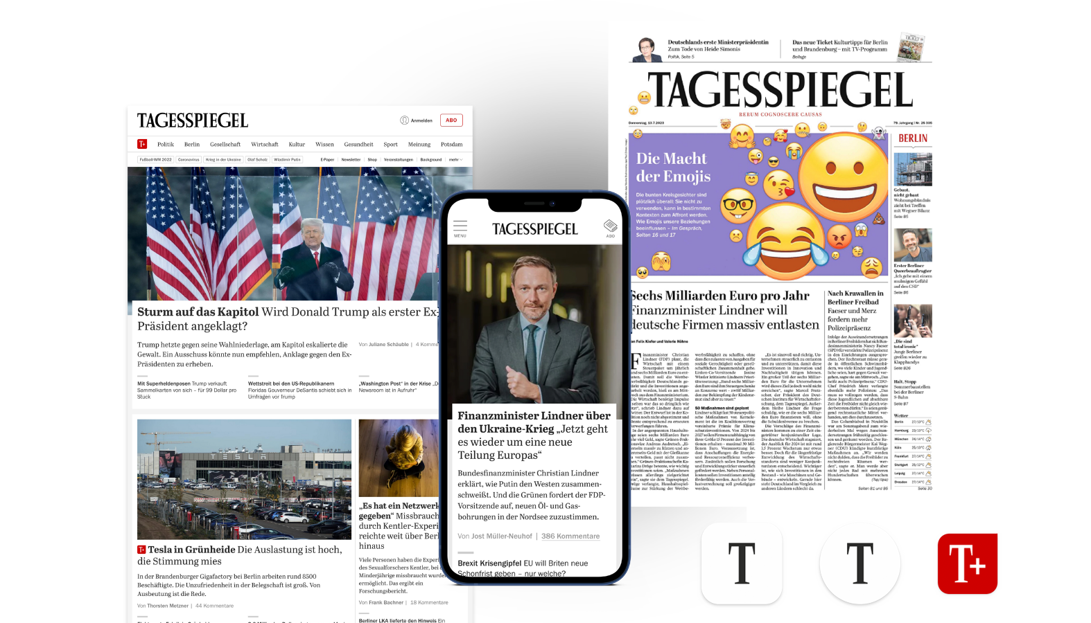
The new Tagesspiegel logo in use: