Revenue-driven design framework – Augsburger Allgemeine
Revenue-driven design framework – Augsburger Allgemeine
2023 – 2024 | 👉 Editorial design
Client:
Mediengruppe Pressedruck (with prepublic)
Brief:
Create a revenue-driven, mobile-first design framework with a focus on customer segmentation.
Case:
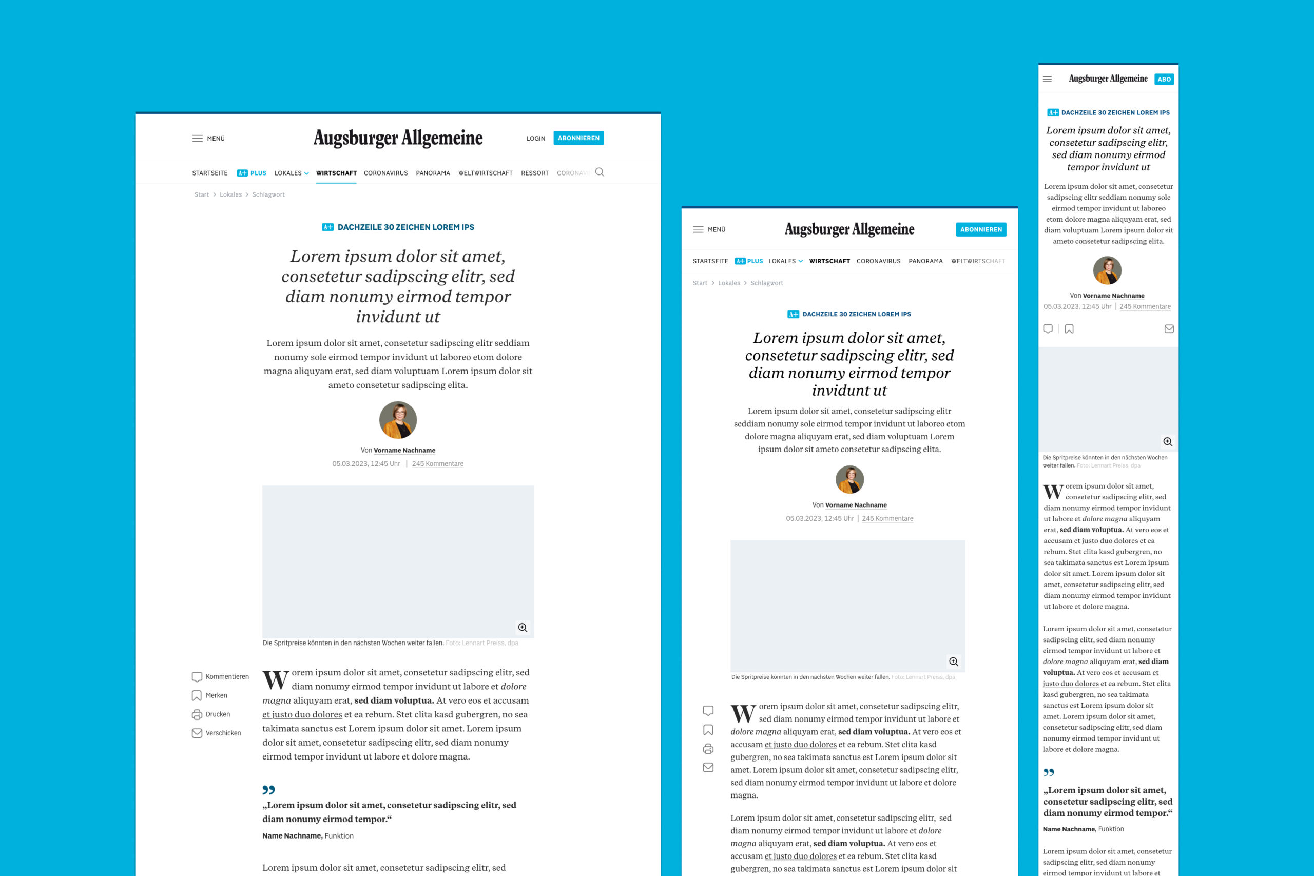
The Augsburger Allgemeine website redesign was crafted with a mobile-centric approach to serve a primarily on-the-go readership. The project introduced a "revenue-driven design framework," prioritizing user segmentation to cater to casual visitors, potential subscribers, and existing customers. The result is a highly optimized, responsive site that balances aesthetic appeal with functionality, guiding users smoothly through content while promoting engagement and conversion. Consistent typography across channels reinforces brand identity, supporting Augsburger Allgemeine’s strategic focus on growth through digital subscriptions.
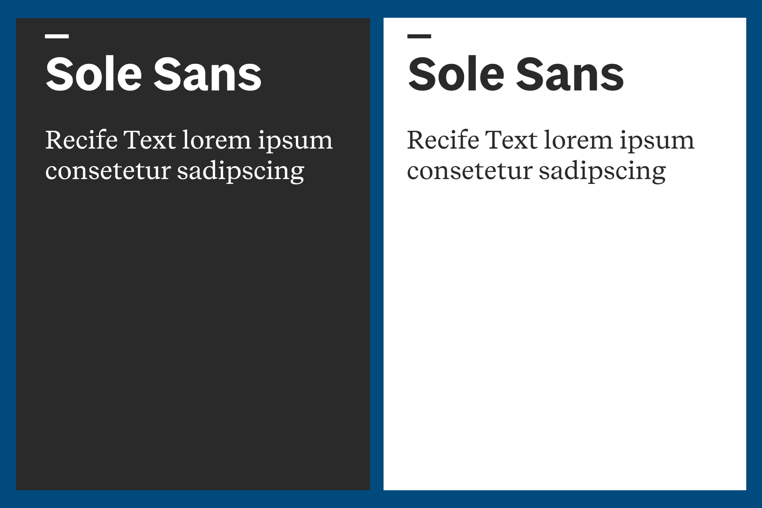
Until now, the Augsburger Allgemeine used Google Fonts, which resulted in an overly generic and ubiquitous typeface. With the relaunch, the "Sole" and "Recife" fonts were introduced, now being used consistently across all digital and print products.
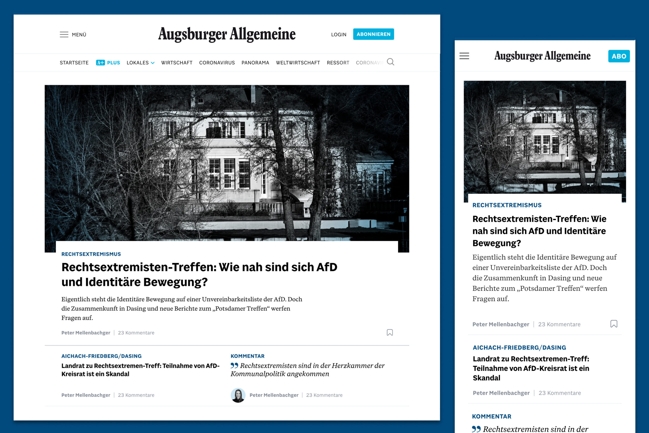
All article templates were revised—not only visually but also in terms of how the editorial team populates articles using the new CMS, CUE.
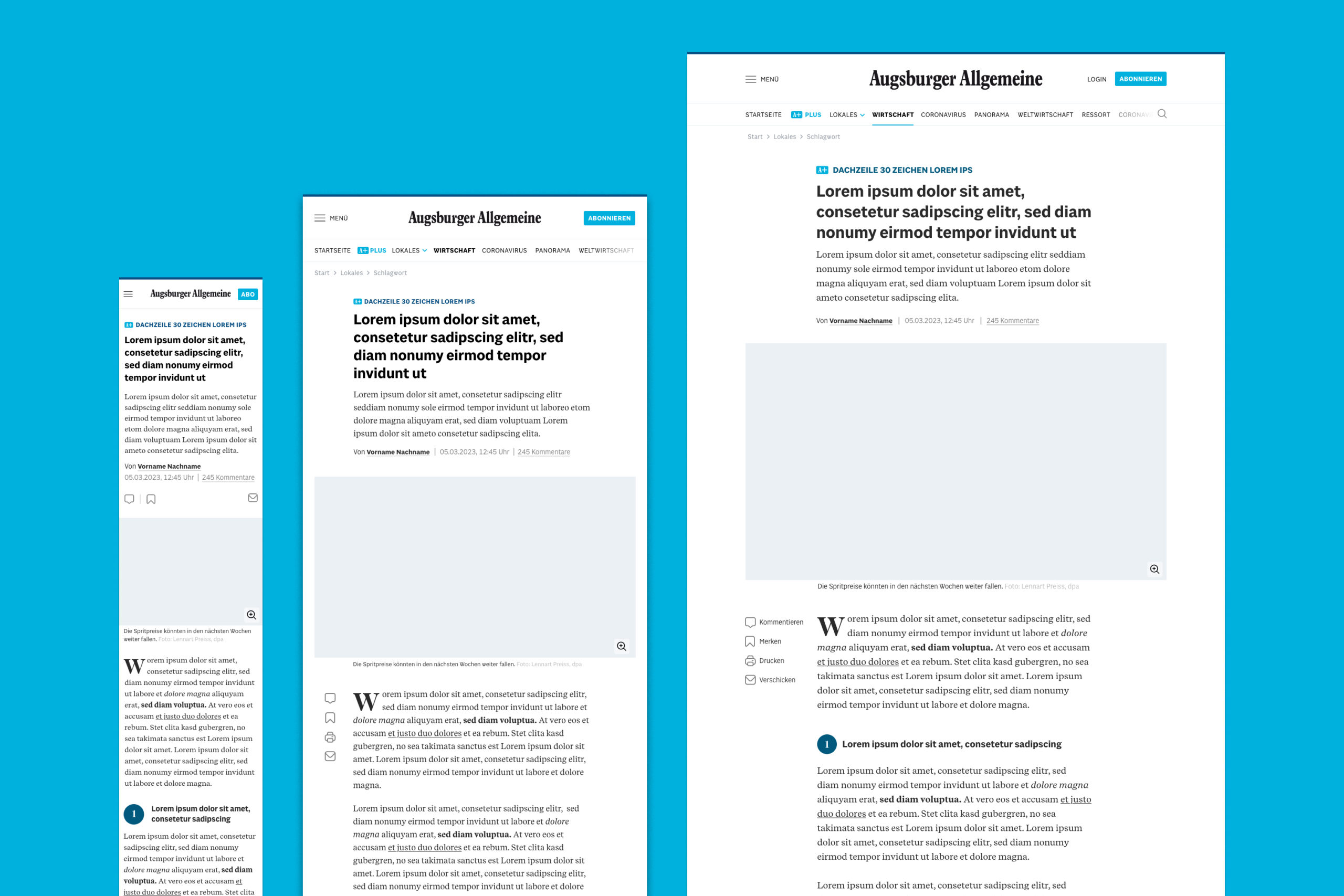
News content and opinion pieces from the editorial team are now easier for readers of the Augsburger Allgemeine to distinguish, thanks to distinct article templates and differentiated typography.
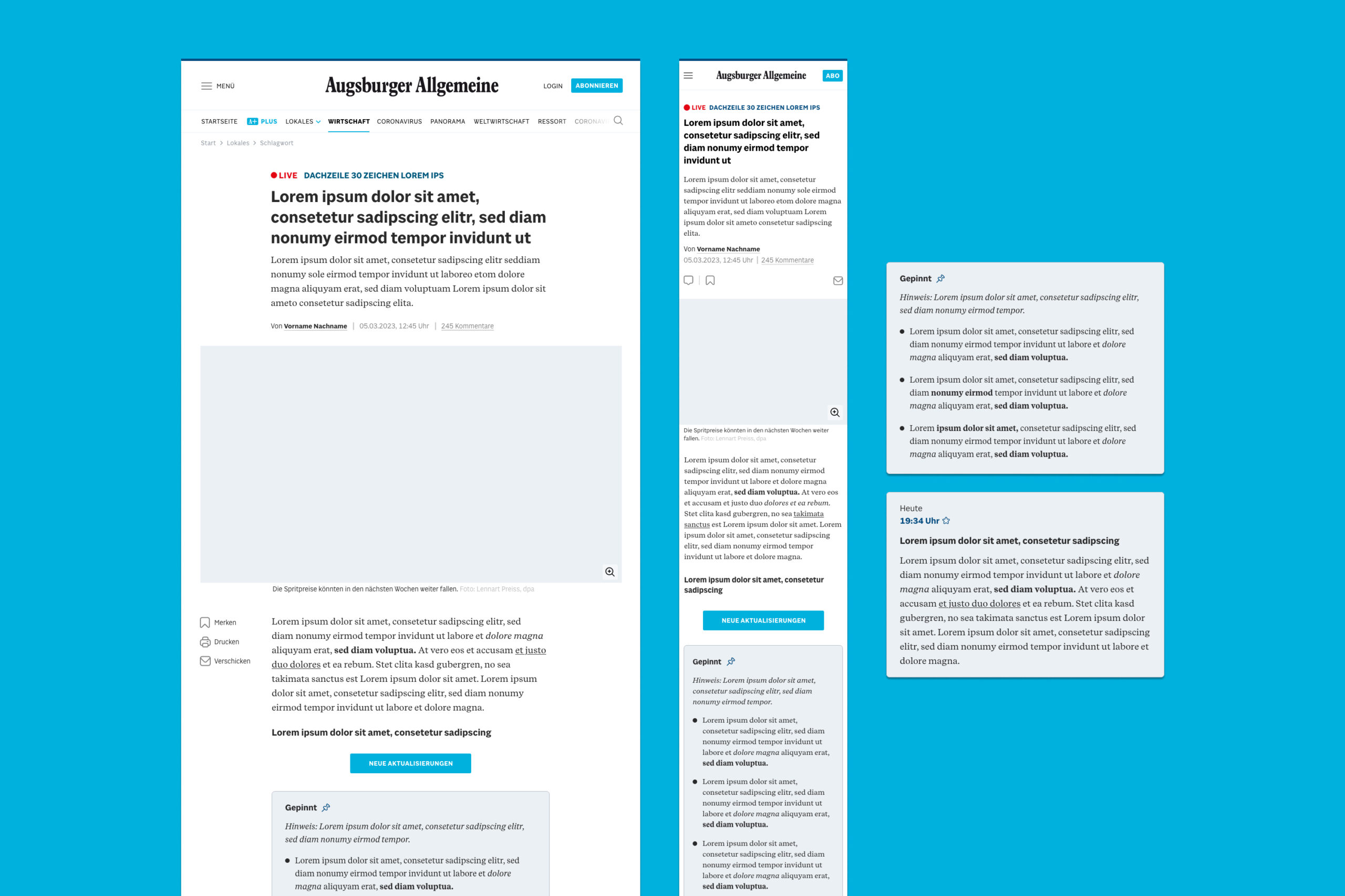
A dedicated live blog template was introduced at launch.
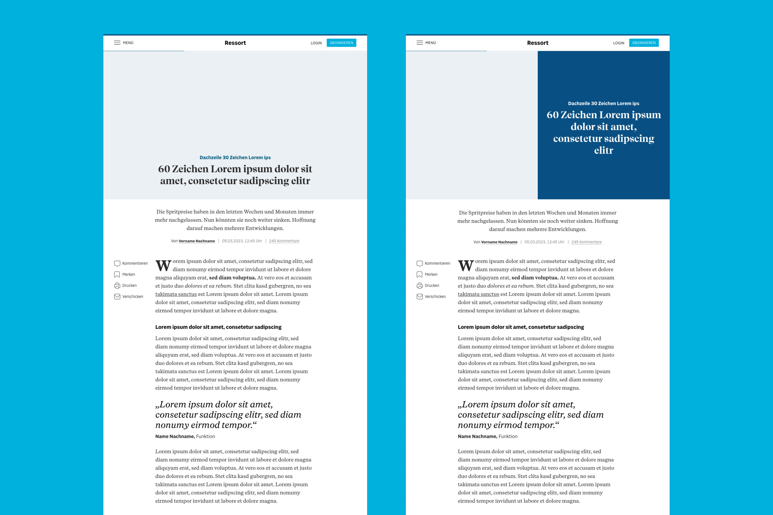
Two templates were created for the editorial team to use for visual and interactive storytelling.
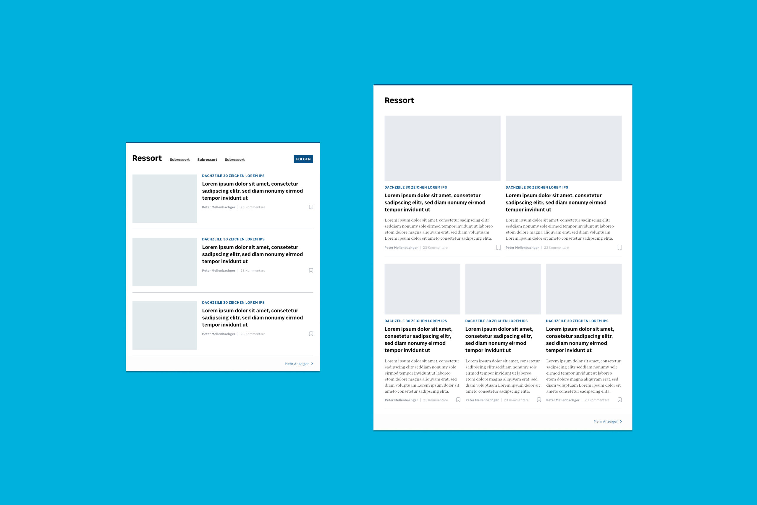
Content on index pages can be displayed in various ways: as a clear list view or an exploratory card layout.