Rebrush of Berliner Zeitung Print Edition
Rebrush of Berliner Zeitung Print Edition
2017 | 👉 Editorial design
Client:
DuMont Mediengruppe (with Jan Hölz)
Brief:
Light redesign of the layout and typography for Berliner Zeitung in collaboration with the editorial and art direction teams.
Case:
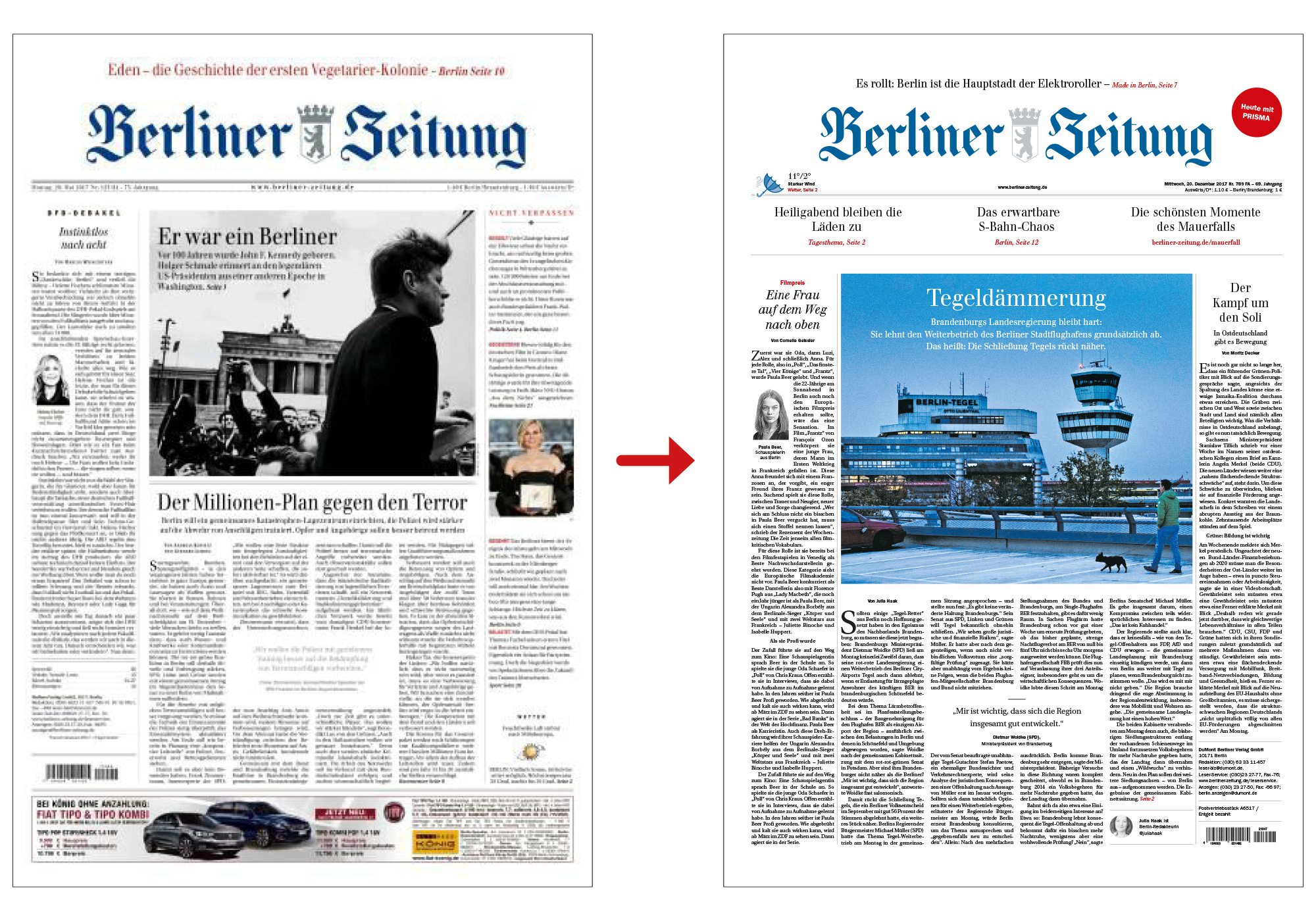
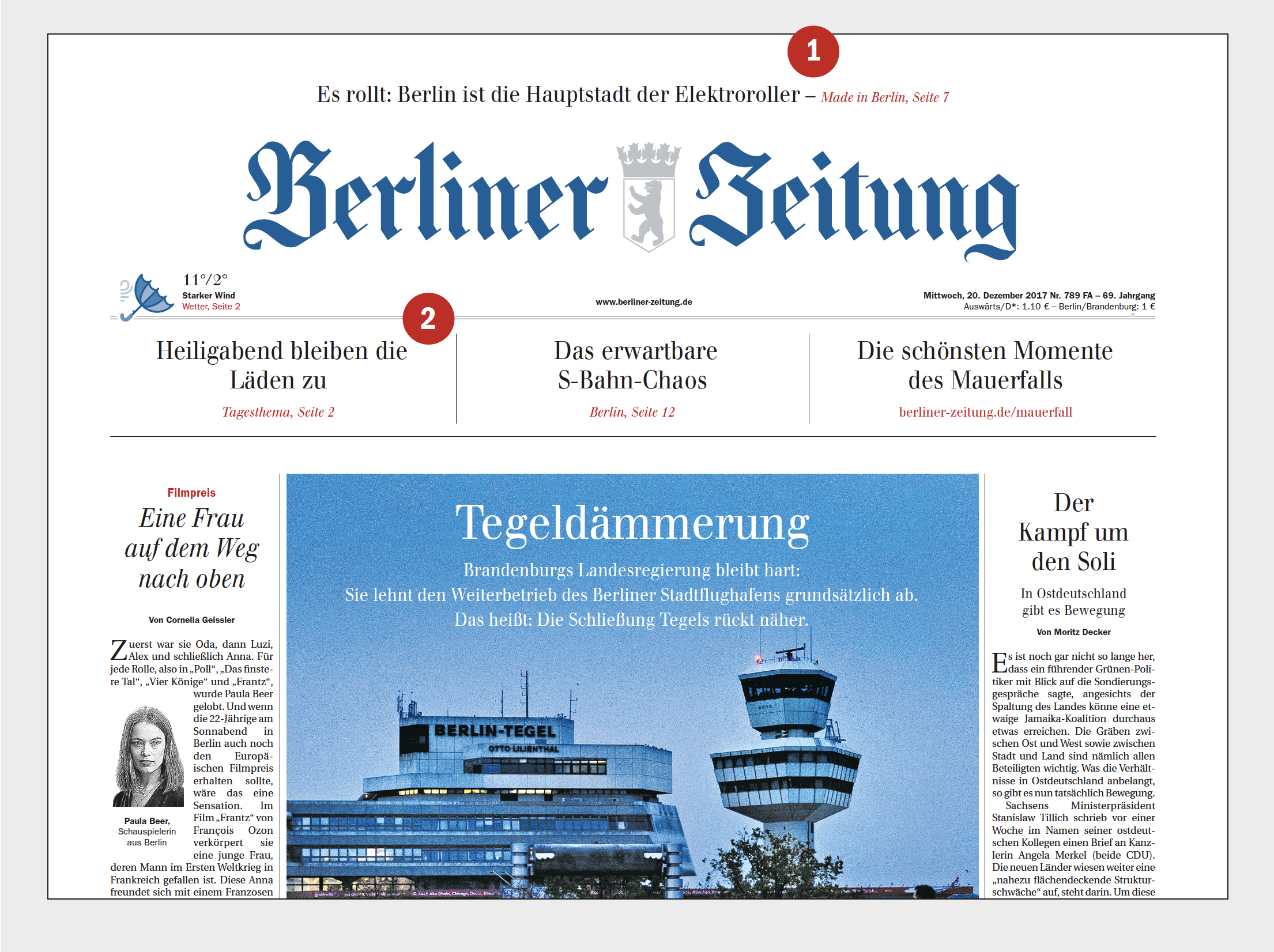
For the Berliner Zeitung, I undertook a rebrush of the print edition, refining its layout and typography to create a refreshed yet familiar look. Working closely with Editor-in-Chief Jochen Arntz and Art Director Annette Tiedge, the redesign focused on subtle adjustments that preserved the newspaper's established identity while enhancing readability and visual appeal. This light-touch approach brought a renewed clarity and modernity to the publication, aligning with Berliner Zeitung’s commitment to delivering high-quality journalism with a refined visual presence.
Redesign of the front page: clearer structure and layout, enhanced options for content teasers, improved readability, and better brand presentation:
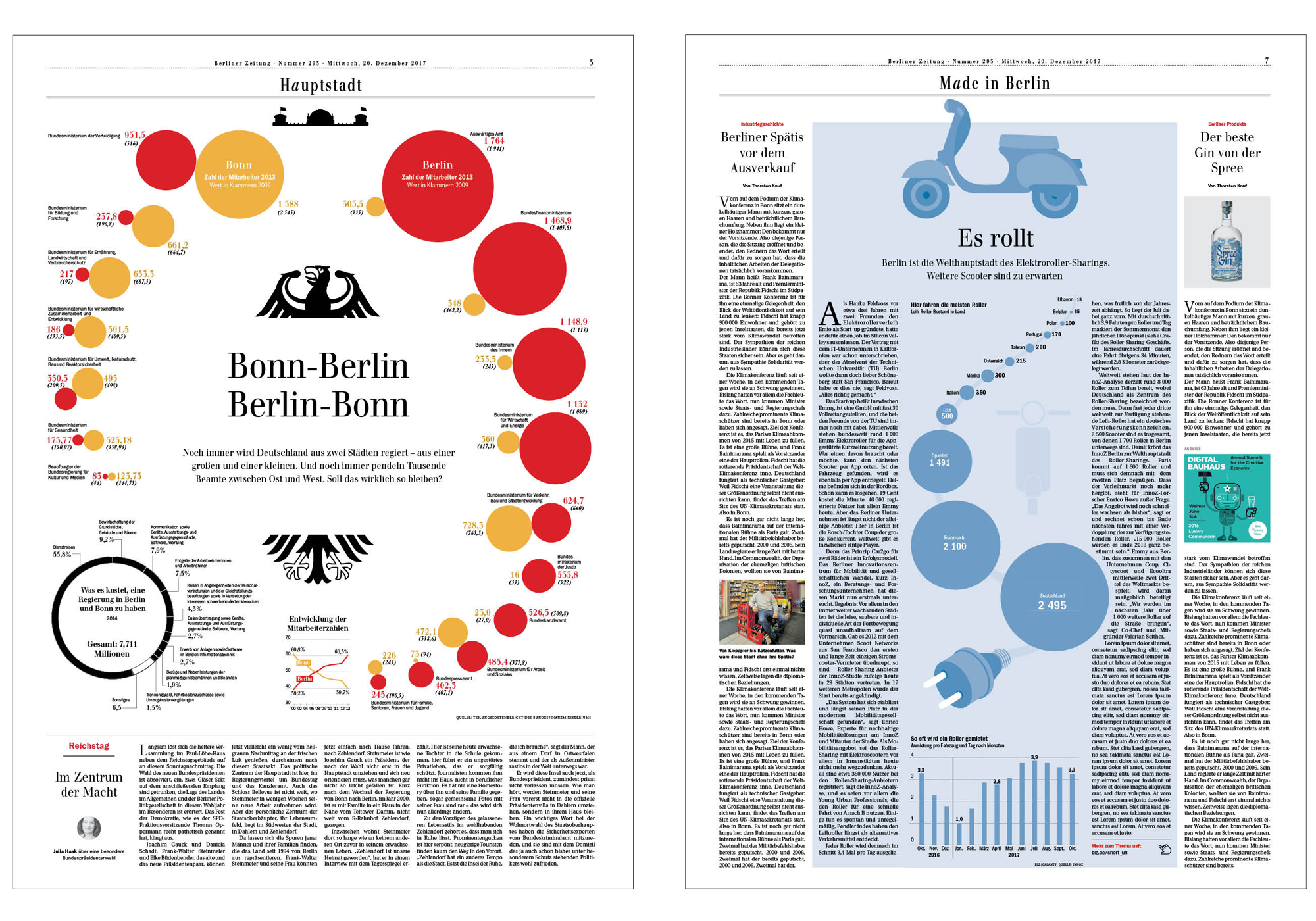
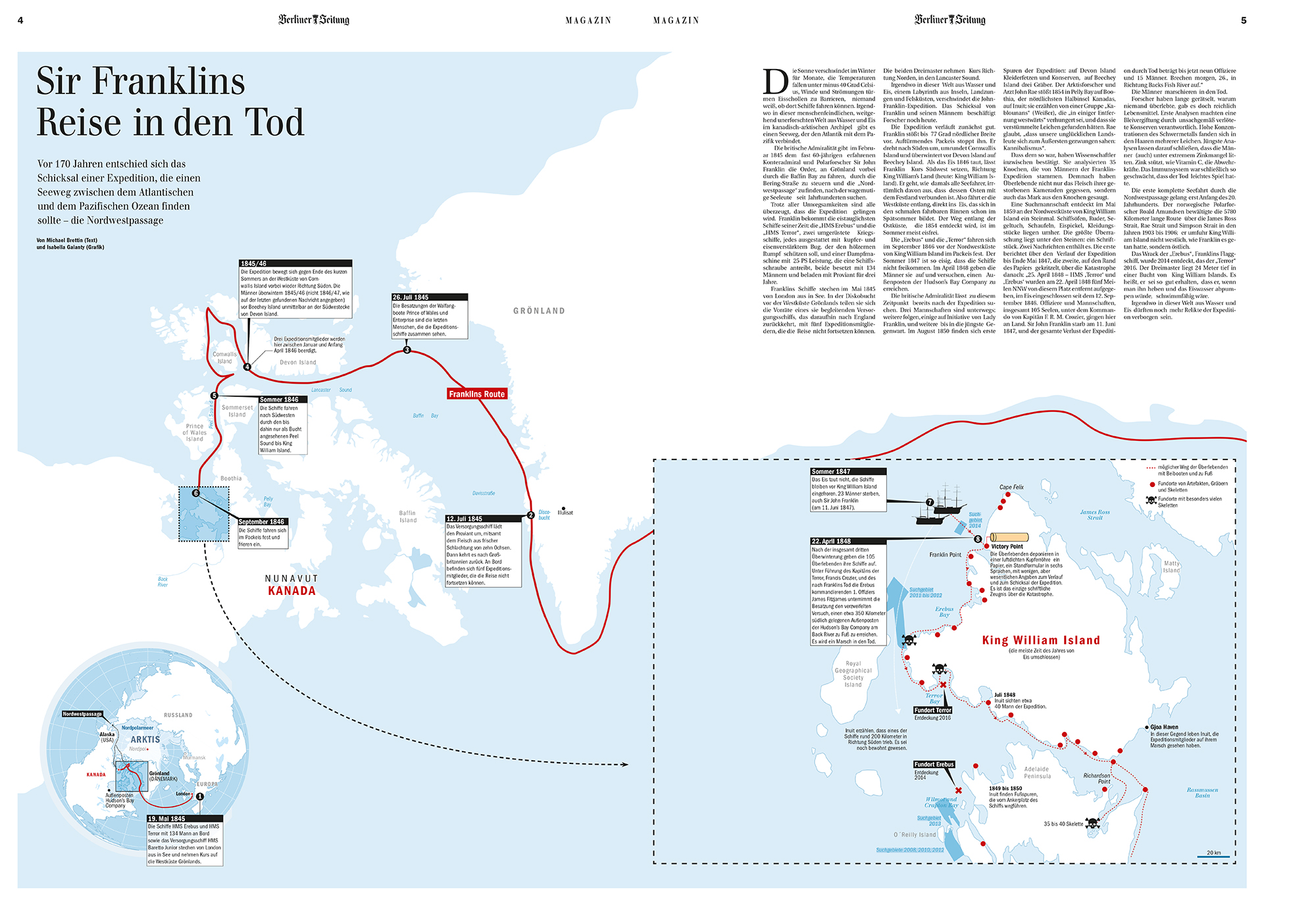
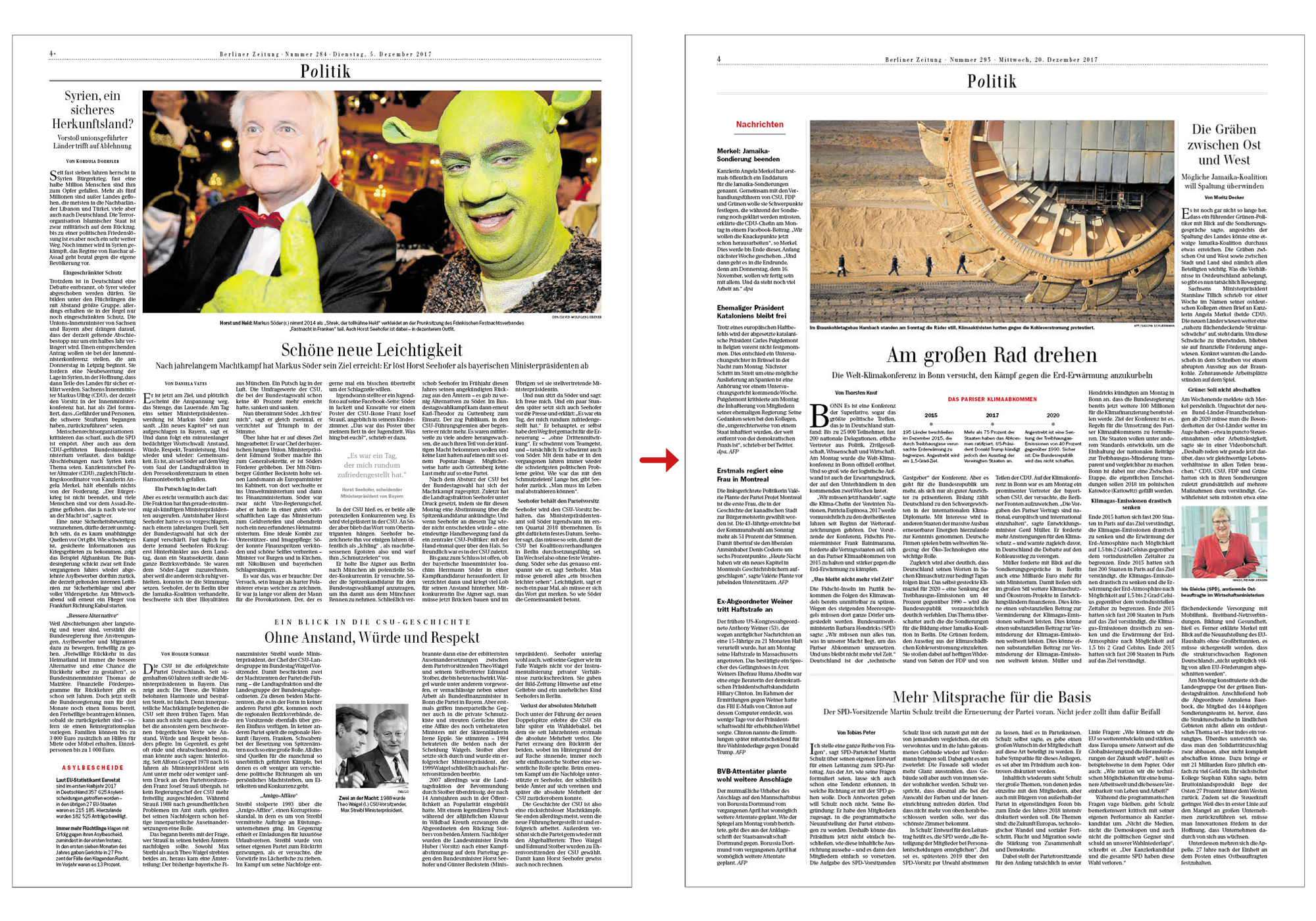
The text layout on the inner pages was slightly adjusted to ensure better reading flow and an improved reading experience. Headline sizes were optimized, and the overall information architecture was subtly refined:
For the launch, Berliner Zeitung produced a video in which I explain the updates and adjustments made during the rebrush:
As part of the rebrush, several new pages were introduced, such as the "Capital Page" and "Made in Berlin." Additionally, the newspaper's magazine was slightly revised:
